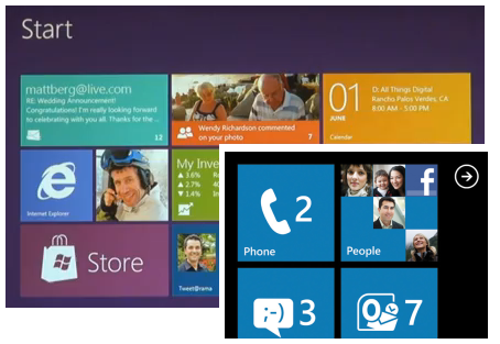
Windows 8 shall became one of the most important changes that Microsoft done into its operating system for more than a decade since Windows 95…
Let’s take a look first at the aging Start Menu from Windows 95 to Windows 7…


looks the same and feels older now - right?
A new Beginning Design UI for Windows 8
Seeing the new version having a new platform that supports ARM and several technologies at CES 2011, we've been excited for the upcoming Windows 8 for a long long time, downloading those fake leaks, and thankfully, Windows 8 was shown to the public for the first time with new UI that looks like Windows Phone and was designed to be really fast and fluid for Windows Tablets and PCs.
Platform support for new design
News designs by Intel, ARM Snapdragon processor, AMD, Texas Instruments Omap and Nvidia.
User Interface Features
Start Screen Tiles
Swipe Apps feature

- Sliding from left to right
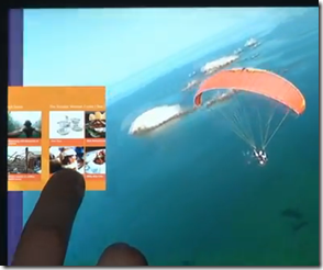
Snap to dock feature
you can drag to resize the width
HTML 5 and Javascript Programming
The new platform is based on new web technologies so, it will maximize the touch features using HTML 5 and Javascript that will allow million of developers to create a new kind of app with Windows 8 – really cool… right?

Apps are fullscreen and beautiful designed for touch technologies…
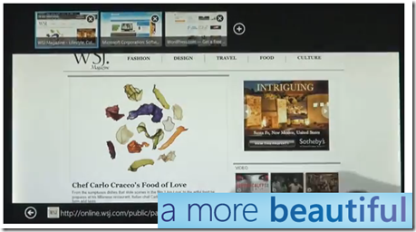
Internet Explorer 10 – Touch First UI and Switching Tabs
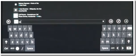
Touch Keyboard

with thumbs layout for easy typing
Windows 8 Apps
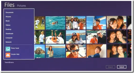

Anyway, you can always go back to the good old look of windows afterwards…
Let’s also wait for the “business and techie” features in the coming weeks.
Can’t wait!!!
Thanks for reading the quick view of “a more and beautiful” Windows 8…




0 comments:
Post a Comment